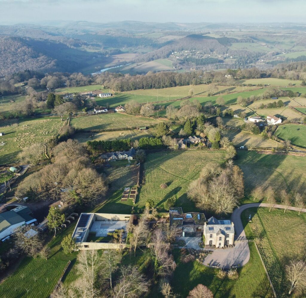
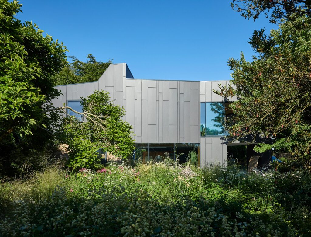
Recently crowned House of the Year here in the UK, it goes without saying that House on the Hill was going to be something special and it definitely doesn’t disappoint. Designed by Alison Brooks Architecture, this majestic piece of design sees old meet new in perfect harmony and the juxtaposition of the different structures on show truly is a sight to behold. House on the Hill is an art-filled black house that has been nestled alongside a glorious Georgian farmhouse in Gloucestershire that has been converted into a dedicated gallery space.
Alison Brooks Architects designed House on the Hill to be a space for the clients to make the most of living with their mighty impressive art collection within the Wye Valley in Gloucestershire and the way in which they have tied two very different pieces of architecture together is nothing short of extraordinary. It consists of two clearly distinct volumes – namely, the original 18th-century farm house and the two-storey West Wing extension that has been emerged from it. The black, stealthy looking extension, which contains all of the property’s living spaces, has been designed to be clearly at odds from a visual perspective from the original building. And looks all the more amazing because of it in our opinion here at Coolector HQ.
OLD MEETS NEW IN STYLE
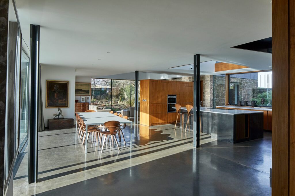
The aesthetic of House on the Hill is best described as a journey between the 18th century and the 21st century, both conceptually and literally and you’ll be amazed upon seeing just how innovative many of the home’s design features are. It has a double-height gallery that has been built in the original farm house alongside an office, with a ramp connecting the building to the West Wing extension. The contemporary addition to House on the Hill has a predominantly open-plan ground floor layout which consists of a kitchen, dining area and double-height living space.
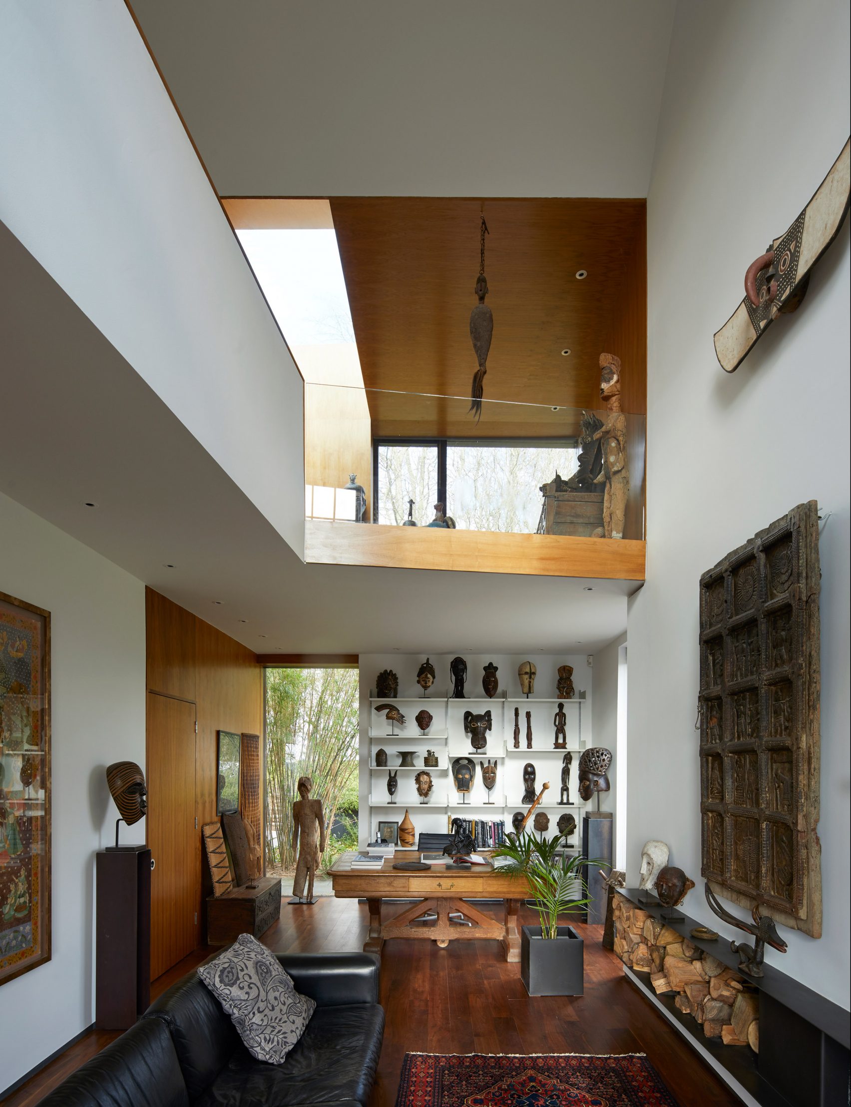
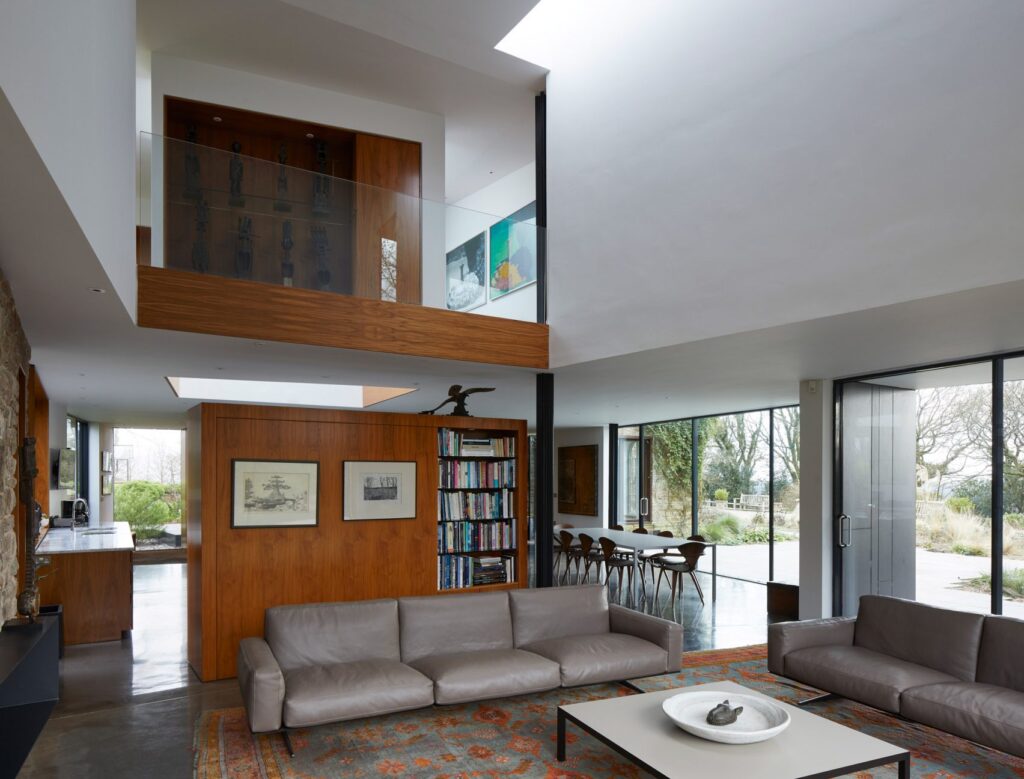
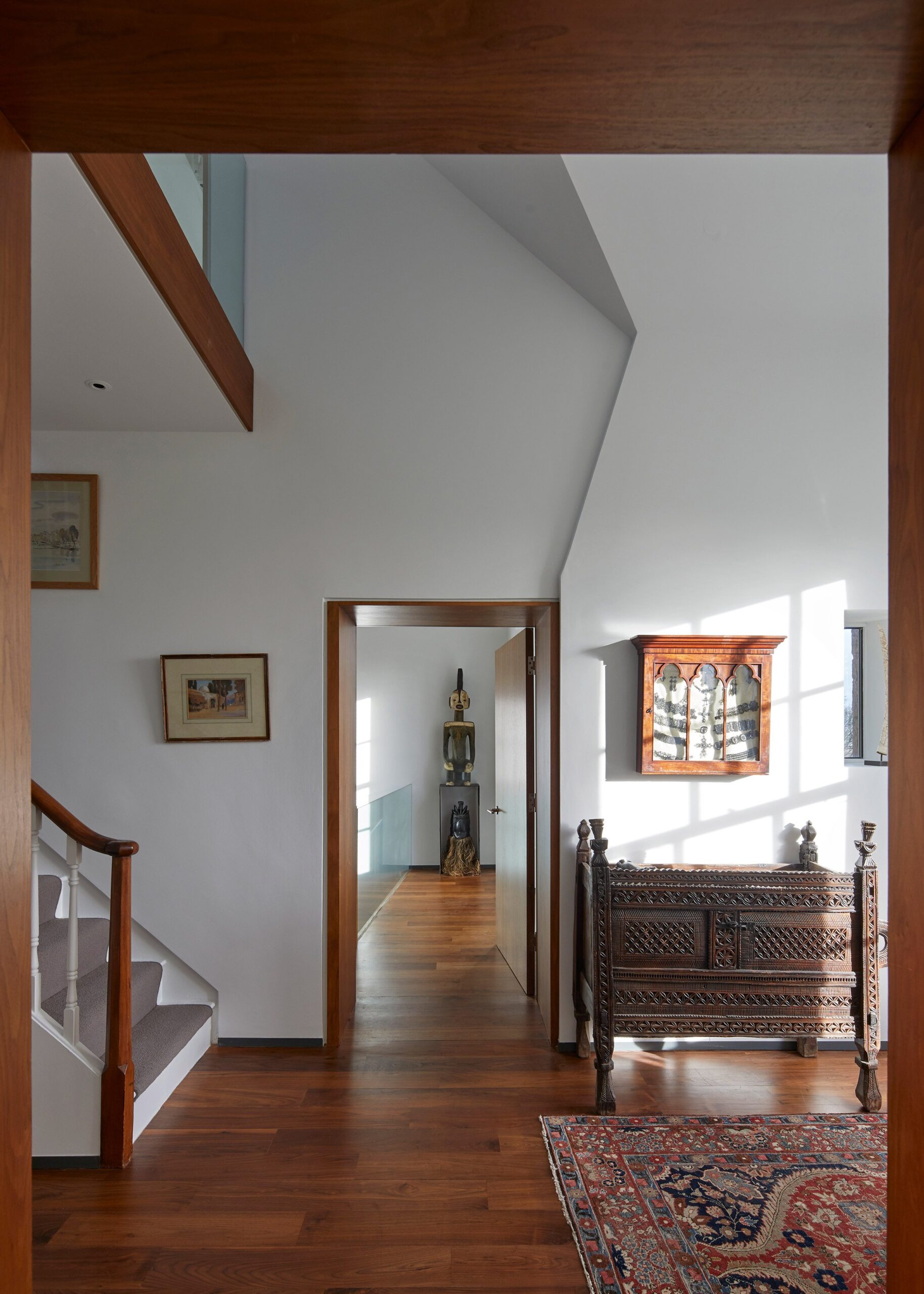
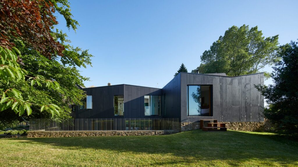
Impeccably designed both inside and out, House on the Hill from Alison Brooks Architecture is made of continuous planar elements that fold in three dimensions to deliver very particular spatial and light conditions – from the sky or from windows that are found throughout the home. The modern extension of the home is largely akin to an atrium house, with the kitchen island and the first floor gallery above purposively designed to be the heart of the house from which all else emanates.
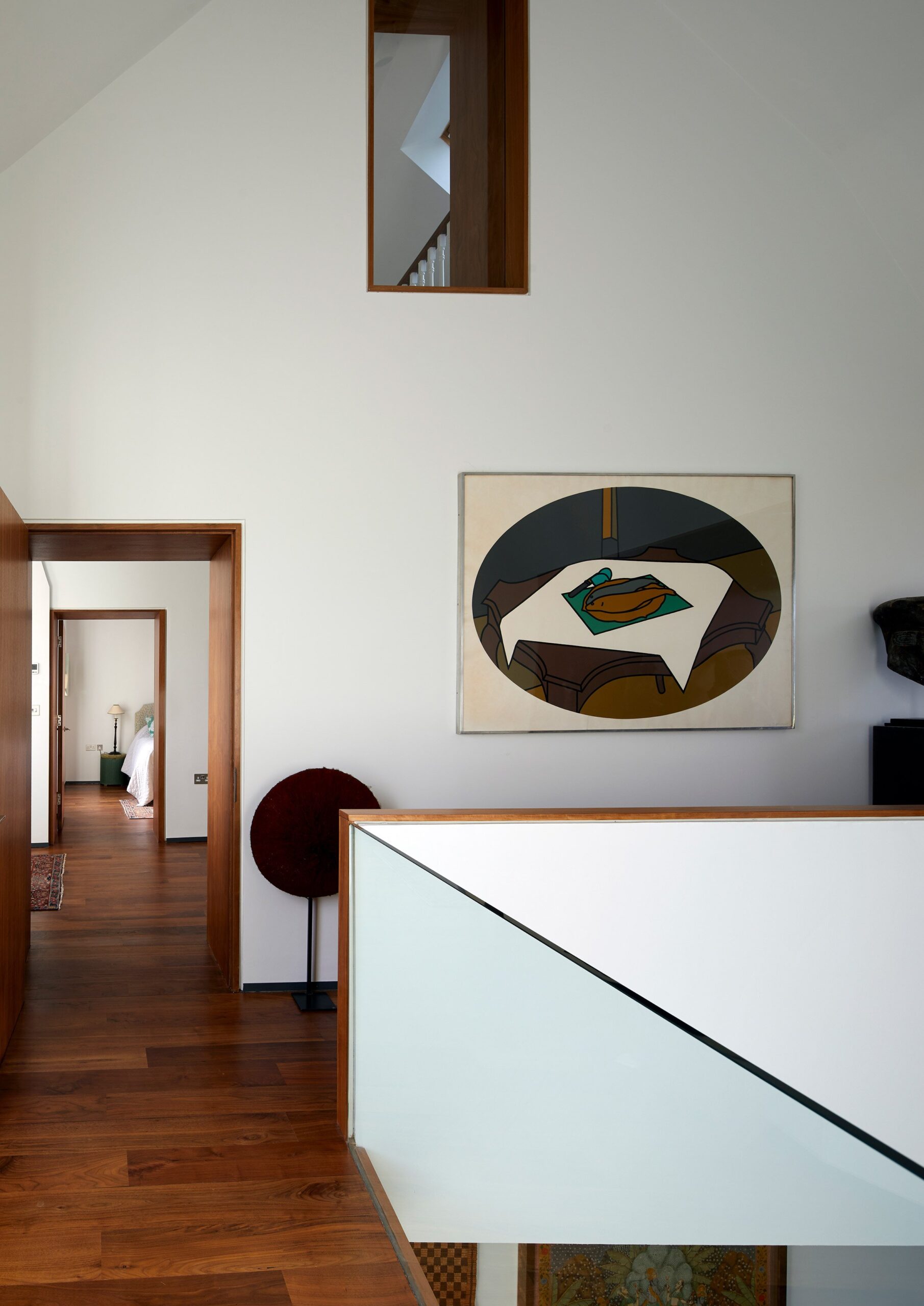
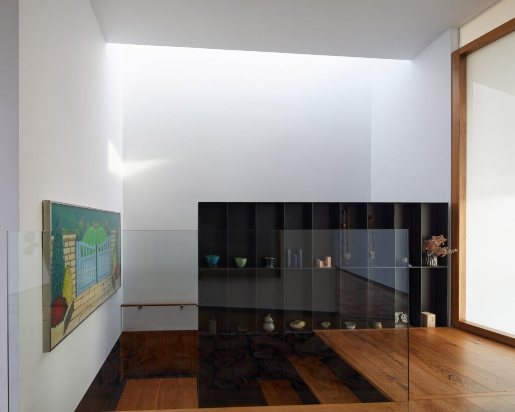
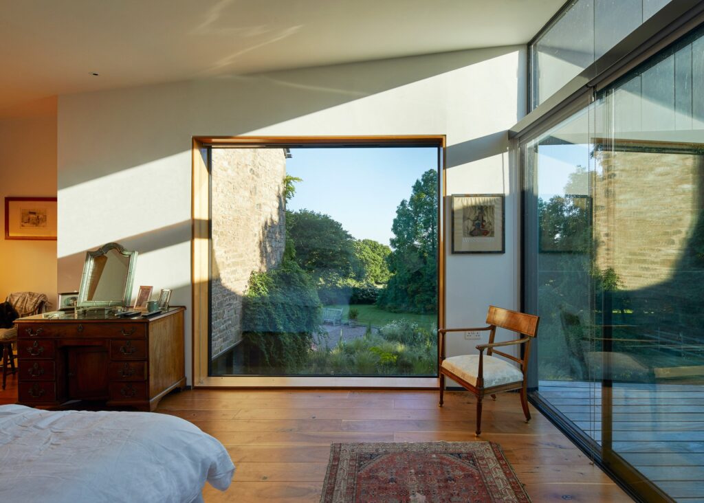
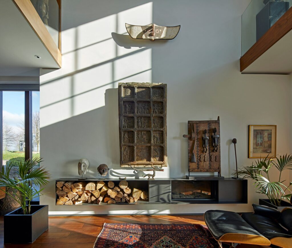
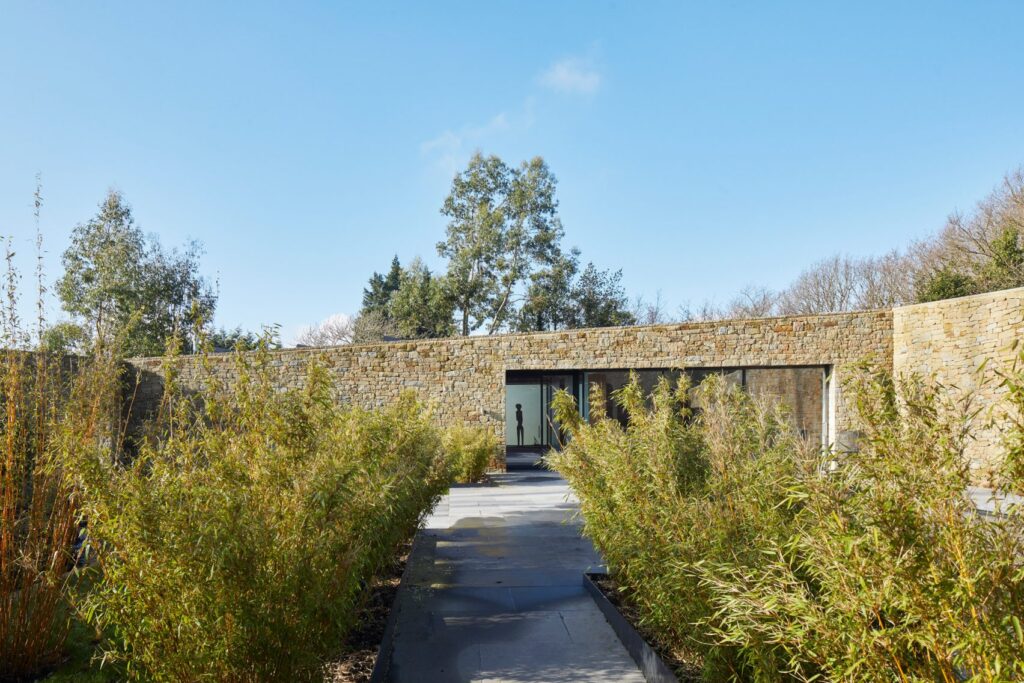
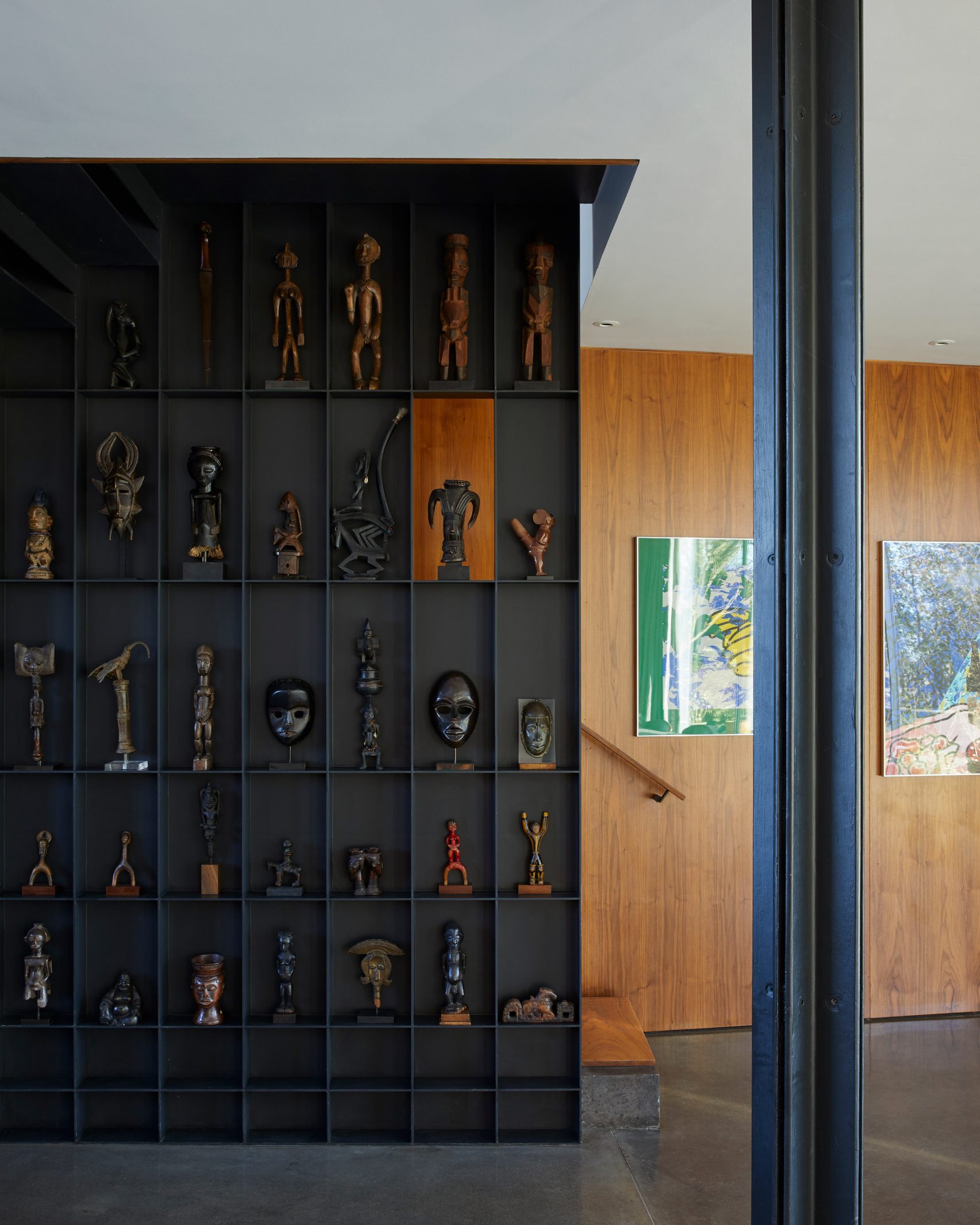
The property’s principal staircase has been cleverly designed as a mini gallery to display various works of art. The aptly named Stair for 100 Objects contains a vertical steel grillage that has 100 cells for the owner’s small pieces. There are two bedrooms that can be located on the extension’s first floor, with two further bedrooms on the upper stories of the original house. The West Wing’s upper floor also houses an office and a majestic looking terrace that is perfect for relaxing during the warmer summer months.
Images: Paul Riddle
- Rustic Canyon Residence: A Modern Treehouse Rooted in Neutra’s Legacy - March 27, 2025
- 8 of the Best Horror Books for your Reading List in 2025 - March 27, 2025
- All the best bits from the new Howler Brothers JT Van Zandt Collection - March 27, 2025


